At Well Workplaces, the focus is to provide tailored corporate wellness programs to businesses and organisations. The core value of the business is that wellness is the foundation of society and that it is the responsibility of employers to ensure the health and wellbeing of their employees.
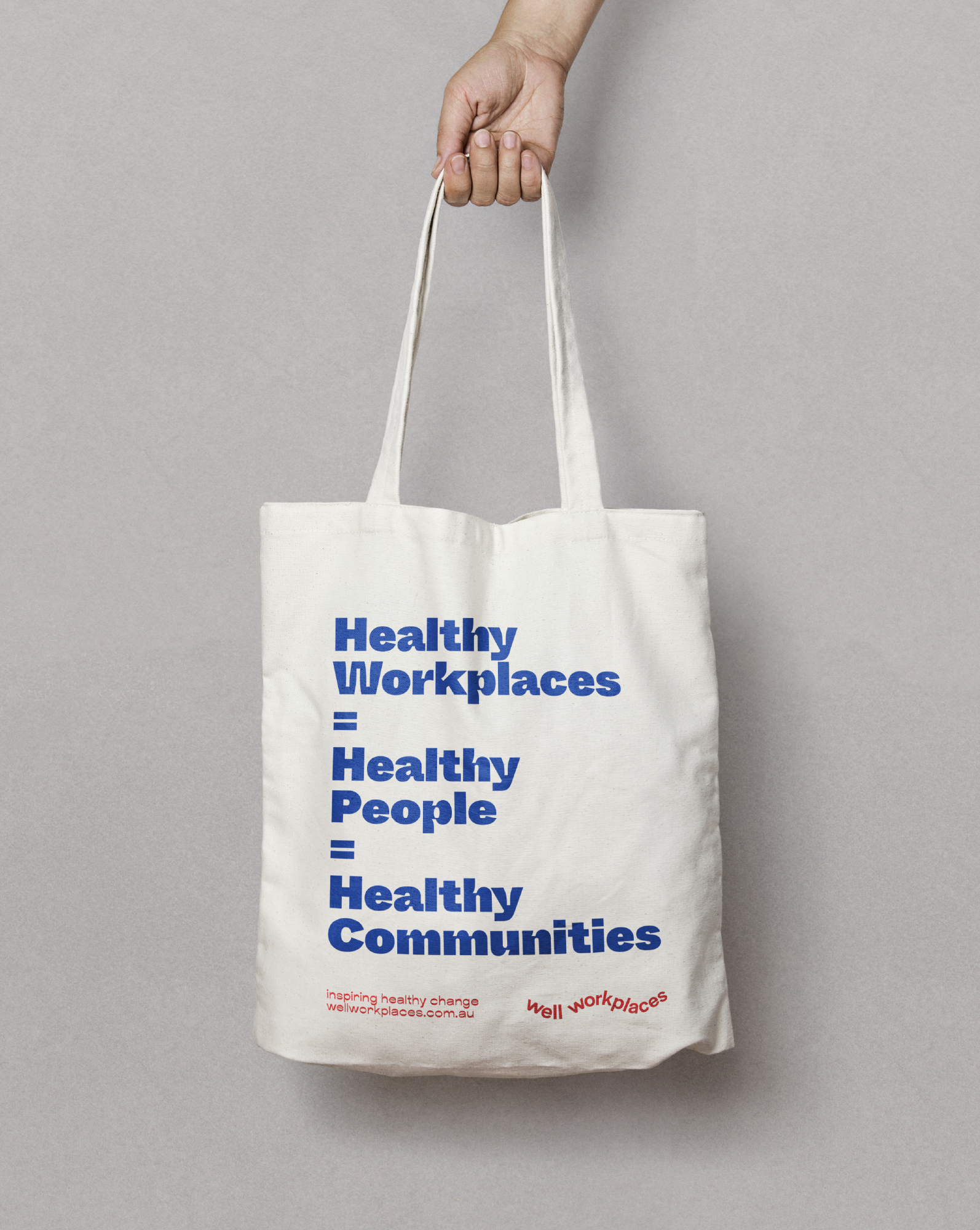
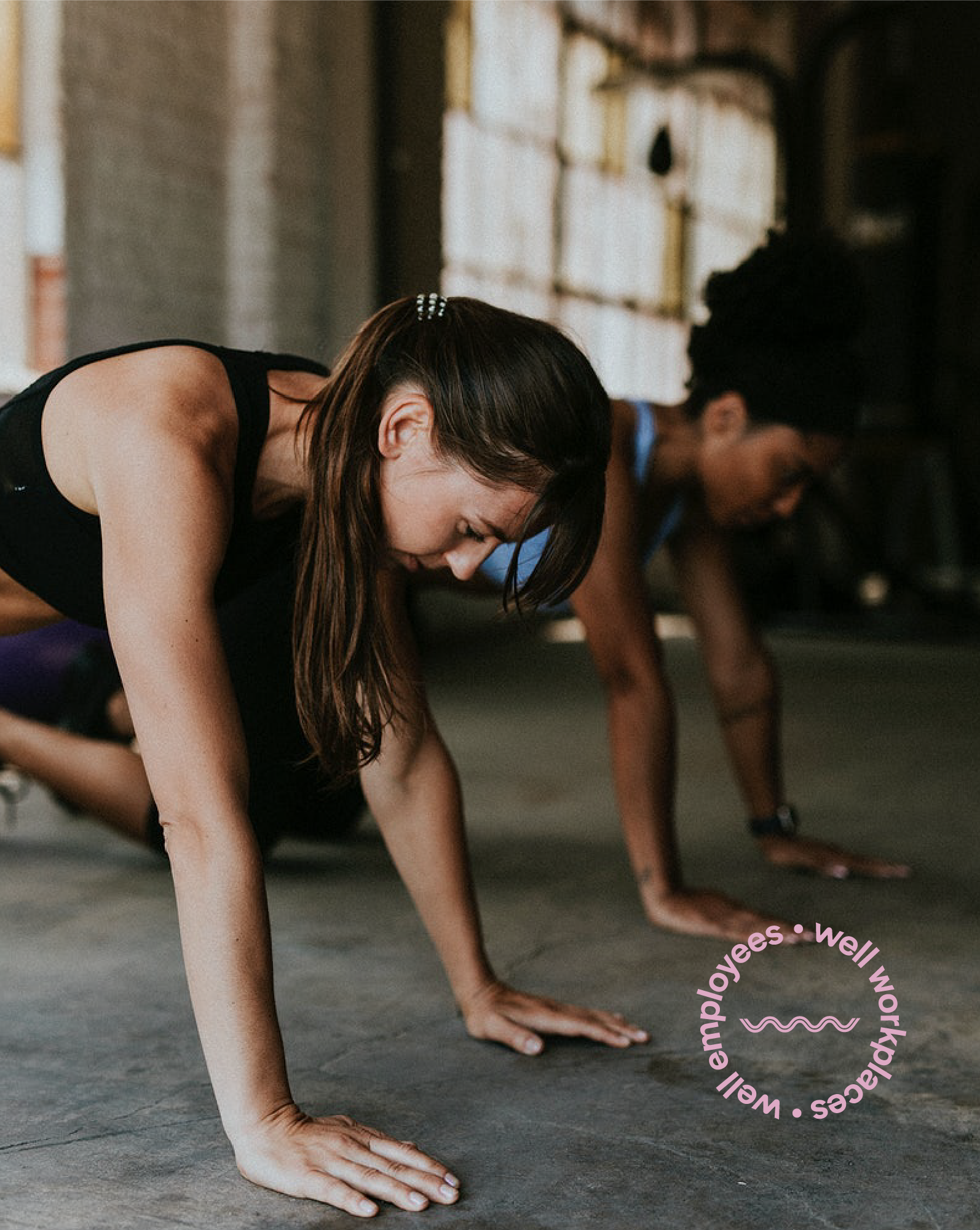
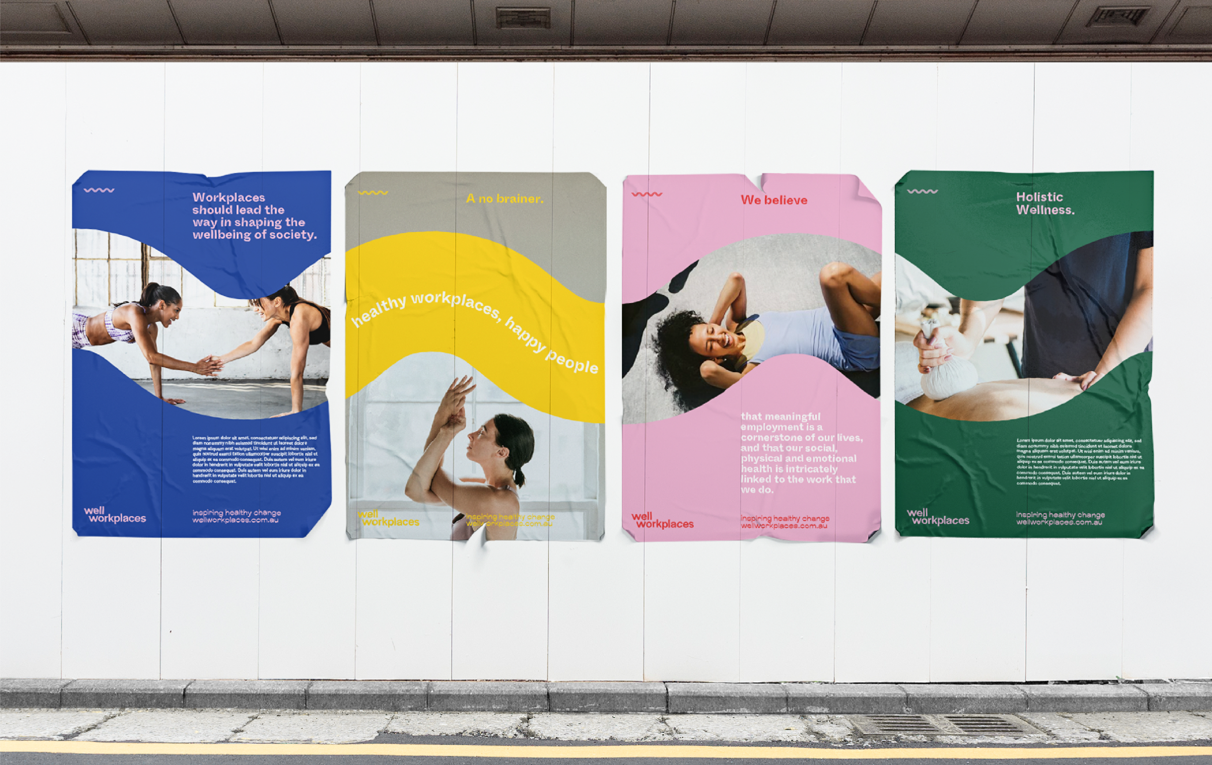
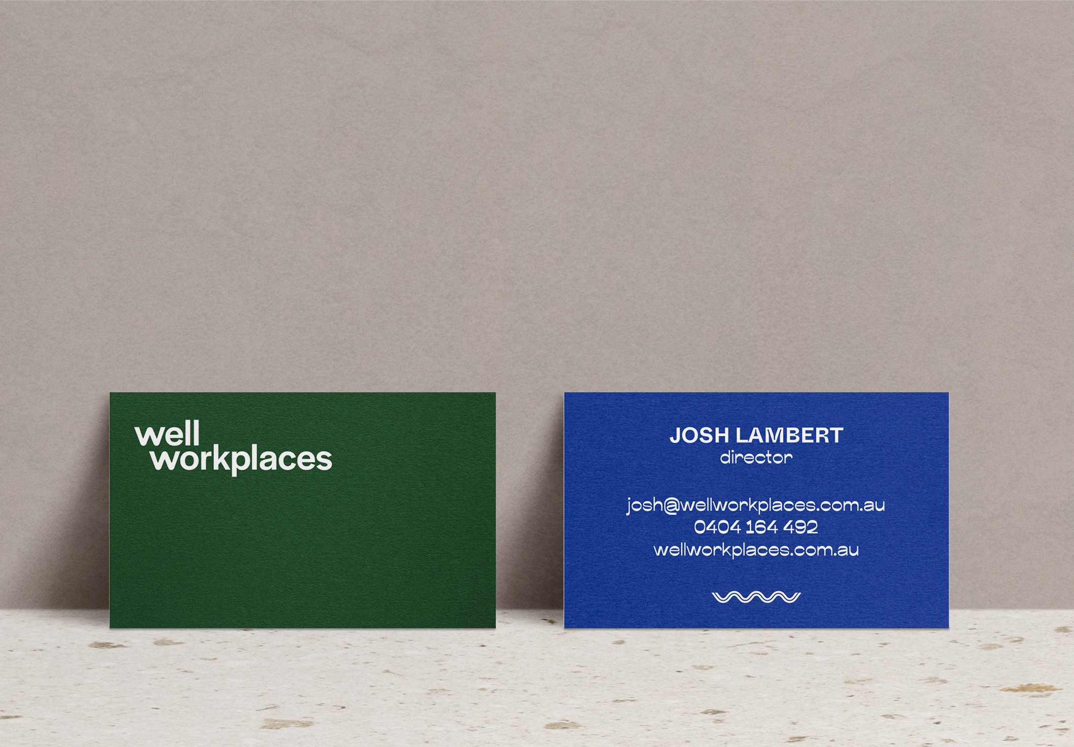
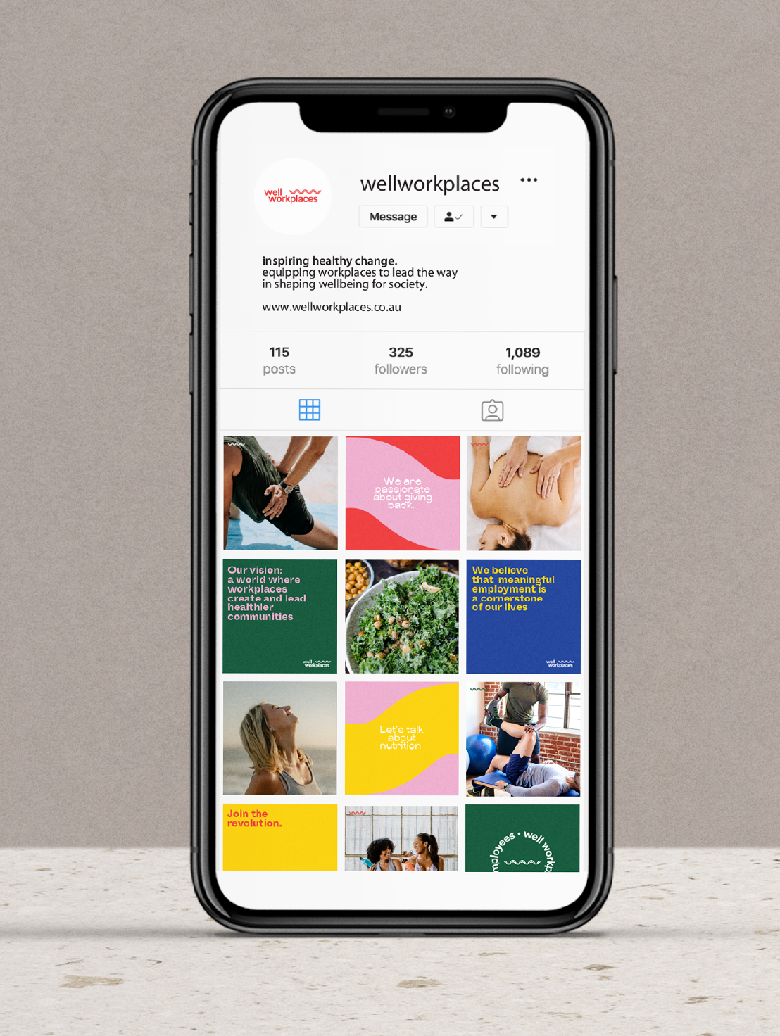
The client wanted a brand that was energetic, inspiring and got people excited about wellness. In response, we created a strong, friendly, modern logo and icon. The ‘wave’ icon is a graphical representation of the alliteration of the two ‘w’s in Well Workplaces. It also symbolises movement, synergy and working together, and was designed with intention that this wave design could be applied over other collateral to create a dynamic impact. A bright, energetic, colour palette paired with fun, loud typography makes this brand playful, eye-catching and unique from other competitors in the health and wellness industry.
BRANDING | SOCIAL MEDIA | PRINT COLLATERAL