EUPHEMIA ORGANICS
food subscription box for the blood type diet
services:
brand identity
website design
copywriting
print collateral
Euphemia is a food subscription service catering to the blood type diet. Stemming from the belief that each person’s DNA has a direct impact on what sort of diet and lifestyle they should live, Euphemia strives to inspire and bring people together to realise their healthiest and happiest selves.
The client wanted to create a brand that represents their focus and commitment to organic produce, an energetic lifestyle and sense of community. Following this brief, a unique set of icons were created to symbolise each blood type, and these icons are subtly referenced in the classic, paired back brand mark.
This system, along with a defined colour palette, serves to simplify user navigation through the website. Fresh, lively photography and friendly, conversational language makes the brand more personable and approachable.
Designed whilst working at Studio Marché.
Instagram @euphemiaorganics


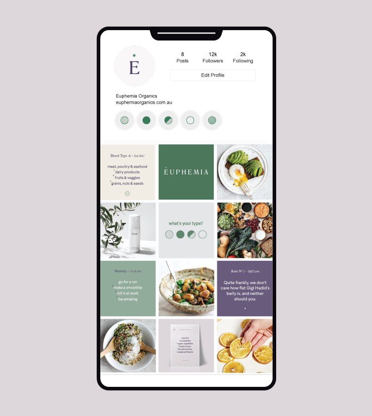

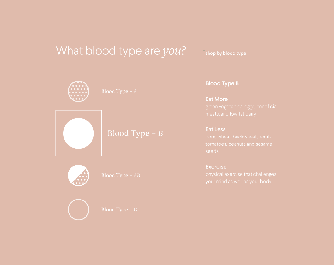


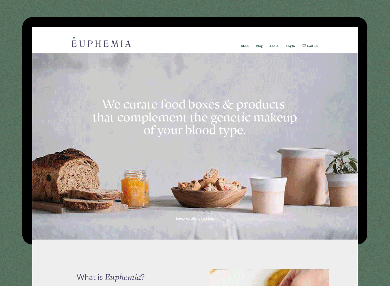


Image credit –
Pinterest, Stocksy